Gits
Packaging Design / Illustration / Team Project

Festive Pack for Gits Food Premix on Durga Pujo theme.
Audience
Tools Used
Millennials and Gen Z living away from family
Adobe Fresco, Adobe InDesign
Product Photography


Attempting to know it all
We started with our research on Durga Pujo. We discovered key elements around it which include Durga Mata, her Trishul, her tiger, musical instruments, popular food items, red & white sarees, sindoor, dhunuchi and shankh.
The design follows the red and white themes of Durga Pujo. The brand uses purple labels for sweet and yellow for savoury dishes, while the logo has red, white and blue colours.

Weaving Concepts
We created a pack of six traditional dishes for individuals living away from their families during Durga Pujo who may not know how to prepare any festive dishes.
The Gits Festive Pack can help bring a homely feel to their celebrations. It would include three sweet and three savoury dishes.
_edited.jpg)
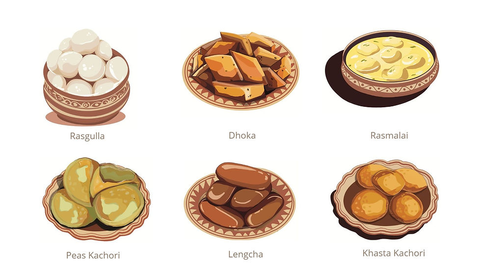
Food Illustration
We illustrated the above food dishes for the front label.

Structure
After much exploration and experimentation, we made a hexagonal structure to create six sections for six dishes.
It would resemble Dhaak on the outside and, when opened, reveal an illustration presented through distortion.
Structure and dimensions

Outer Cover Colour
I experimented with various colours and designs for the packaging's exterior. The challenge was to make it as similar to Dhaak as possible while keeping the main colour red (sindoor).
The final design featured a dark brown wooden base, a bold deep red decorative cloth stripe, and golden brown accents for the strings and border.
Outer Cover Label Design

Inner Illustration
The inner illustration depicted three Dhaaks at the bottom, the goddess's tiger, a devotee in proper attire holding a shankh, and another hand praying with a Dhunuchi.
This illustration embraces the festival by showcasing its beautiful colours and key elements that evoke joy and celebration.
We made 4 variations for the packages.
Prototypes
After many attempts, challenges and changes, we finally made a successful prototype with graphics for the packaging.

Motif
Alpona, a folk Bengali rangoli style, inspires the motif on the cover page.
Multi-functionality
The rectangular lids with perforated edges can be removed and used as beautiful bookmarks later.
_edited.jpg)

My Role
Ideation, Structure & Prototype
(Team effort)
Illustration
(Outer cover Dhaak illustration, one inner illustration)
Photography
(Product Shoot and Editing)
Meet The Team
Rhea Sen, Riya Garg (me), Sakshi Verma, Shruti Sheel
The greatest challenge in this project was mastering the structure. The packaging demanded complex geometry, yet we embraced it, transforming it into a unique and engaging design element. I also had the opportunity to learn about the festival and Bengali culture, which I incorporated into the illustrations—making the project both creatively and personally fulfilling.
Reflections
See More Projects
Crafting Purposeful Designs.
M.
S.


